Bringing Black & White Florals to Life
There’s something so timeless about black and white patterned paper—but adding just a touch of color? That’s where the magic happens.
Today’s project started with a beautifully detailed floral pattern and became a soft, elegant birthday card with only a few added touches.
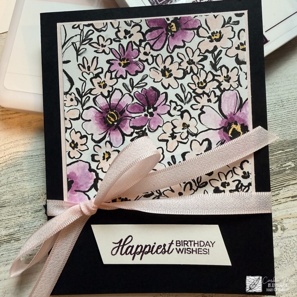
Rather than coloring every flower perfectly, I focused on loose, watercolor-style shading in rich purples and soft blush tones. Leaving portions uncolored helped keep the design airy while allowing those darker blooms to become the focal point.
To balance all of that beautiful floral detail, I paired it with:
- A bold black card base for contrast
- Soft blush ribbon for texture and softness
- A simple sentiment layer to keep the design clean and elegant
One of my favorite details is how the black outlines still shine through after coloring—it gives the finished card a hand-painted look without needing complicated techniques.
This is also such a great reminder that patterned paper doesn’t always have to stay exactly as it comes. Add color, highlight details, experiment with blends… and suddenly one sheet can become something completely your own.
Tip: Try coloring just a handful of florals instead of the entire panel—the selective color makes the finished design feel intentional and keeps the project quick and relaxing.
Thanks for stopping by today—I’d love to know… what color combo would you try next?